What is Squarespace 7.1?
Following up on last week’s blog post about Squarespace templates, we wanted to talk about the new kid on the block, Squarespace 7.1.
We stared working on Squarespace websites when Squarespace 6 was king and have been following closely as Squarespace has grown and evolved. 7.1 has now been in beta for a couple months and looks to be a peek into the future of the platform.
So what’s new in Squarespace 7.1? I’ve been working in 7.1 for the past couple weeks and wanted to offer some of my favorite and least favorite elements of the latest version:
Improvements
Colors & Fonts
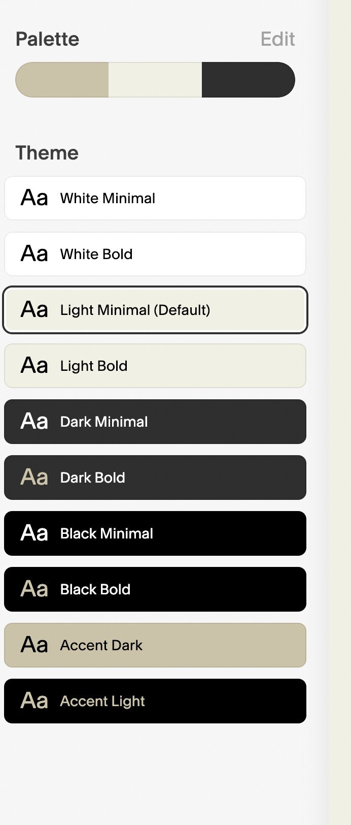
With 7.1 Squarespace brings a new feature to the design panel called “Color Packs” and “Font Packs.” These changes streamline the design workflow by allowing the designer to quickly create a fresh design theme that blankets the entire website all at once. With the click of a button, the site’s appearance can be changed instantly by selecting one of the "professionally curated” color palettes or font packs. No more going through the design panel individually selecting fonts and font colors for every type of element. In 7.1, you get a color and font theme going right away. You even get the ability to generate a color pack based on a photo you upload.
On the color side, the coolest thing however, is that a single color “Palette” automatically generates ten different color “themes,” or variations of the colors you already chose in your palette. These themes include names like “Light Minimal," "Dark Bold," and "Accent Light” essentially combining the colors in your palette in different ways putting light text on a dark background, dark text on a white background, dark text with accent colored headlines, etc etc.
In Squarespace 7, we’ve spent hours and hours coding index page sections to incorporate different color themes like this, and now with a few clicks, 7.1 allows us to do the same with no code!
Portfolios
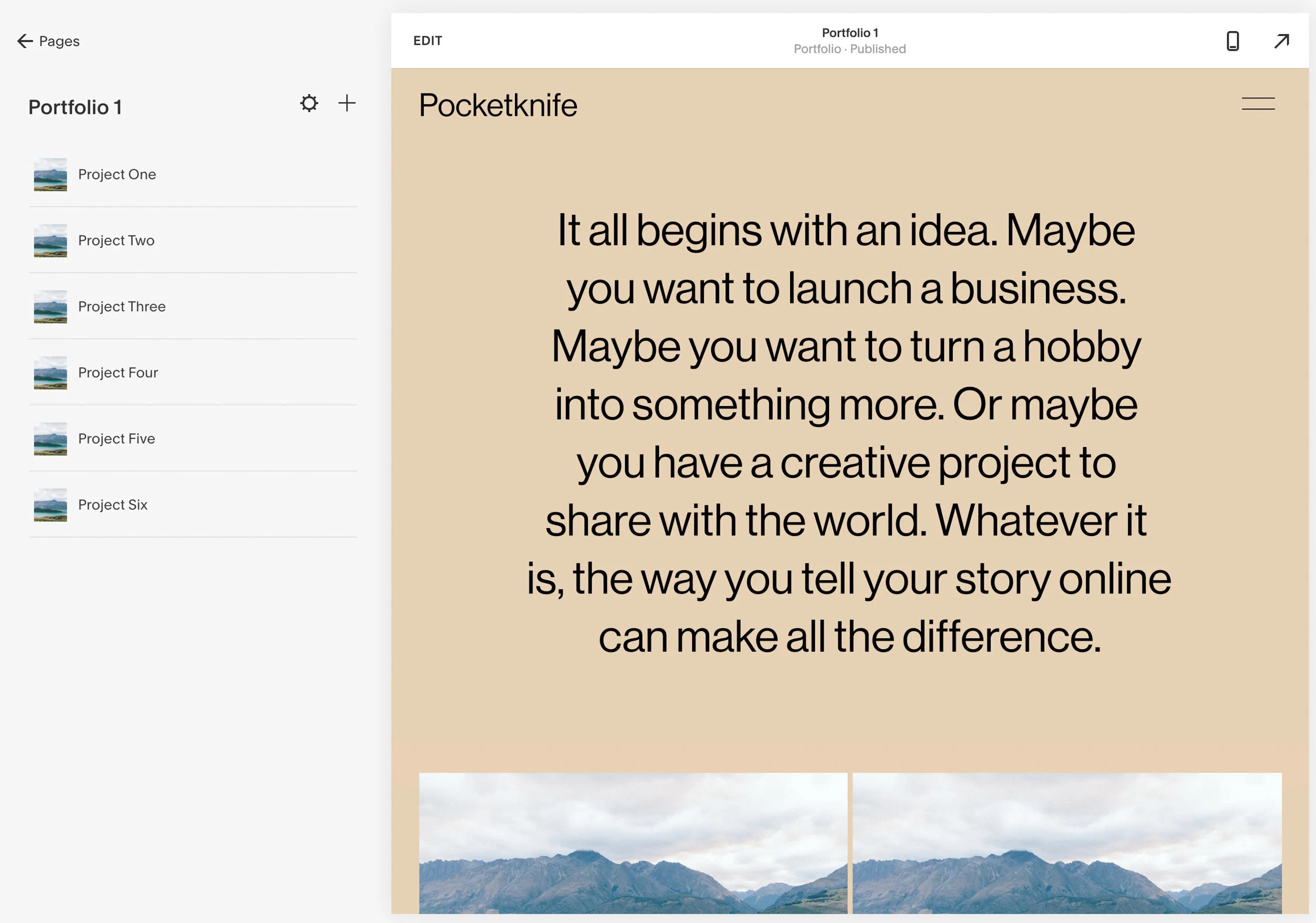
Here at Pocketknife, a lot of our clients need beautiful portfolio websites that are easy to update and look great at the same time. This is why 7.1’s introduction of “Portfolio Pages” is a welcome addition. In 7.1 a Portfolio Page is basically a collection page with links to sub-pages. Each “sub page” can essentially be an individual project page or work example.
Portfolios create a more natural organization for… you guessed it… portfolios.
The brilliance of this is in the organization and functionality. Normally in Squarespace 7, to create a portfolio, we would first create our individual project pages, then create a separate thumbnail gallery and then one by one, link each thumbnail image to its respective project page. 7.1 cuts out several steps by automatically creating the links to each project page and housing all the portfolio pages in one place for organization.
Limitations
As 7.1 is still in its “early access” period, it’s understandable that they’re still working out some of the bugs and dialing in the functionality. With that in mind, let’s take a look at a couple of our “not-so-favorite” changes in 7.1 that we hope Squarespace will take a look at before 7.1’s wider release:
RIP Gallery Blocks
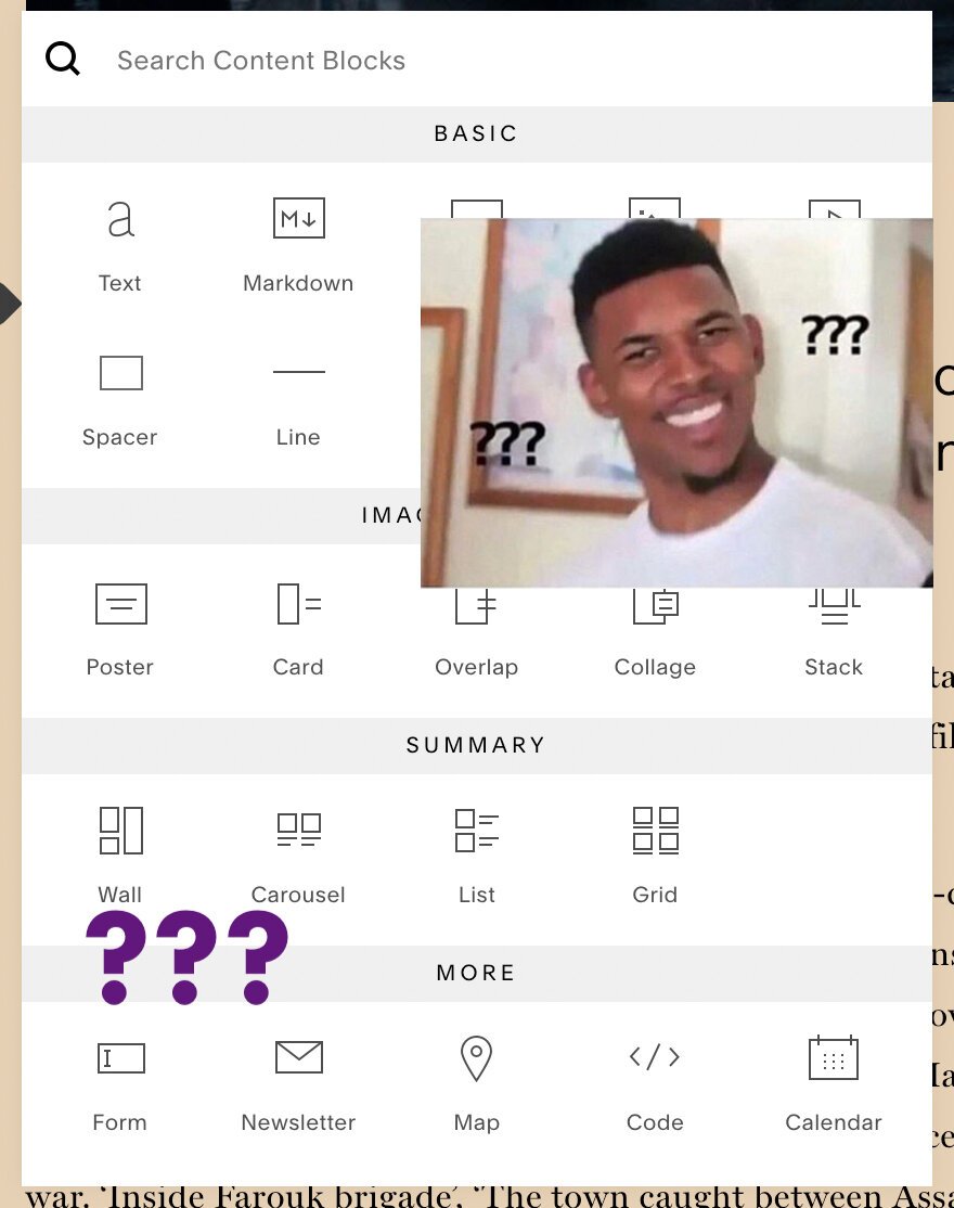
Inexplicably, in 7.1, Squarespace has done away with one of our favorite and most useful content blocks: the Gallery Block. In its place, Squarespace has offered up “Gallery Sections” which have some great features but are a poor substitute for Gallery Blocks. Let’s do a quick rundown of what you can do with each and you can be the judge here:
Gallery Blocks:
Put them anywhere
Plugs directly into Squarespace’s 12 column grid
Use Slideshow, carousel, and grid styles.
Add content directly or pull from a Gallery Page collection
Gallery Sections (7.1)
Can only be full width “sections” in an index
Does not fit with Squarespace’s 12 column grid
You can NOT put any other content (text etc) on this page
Can NOT pull content from a Gallery Page collection (those also don’t exist in 7.1).
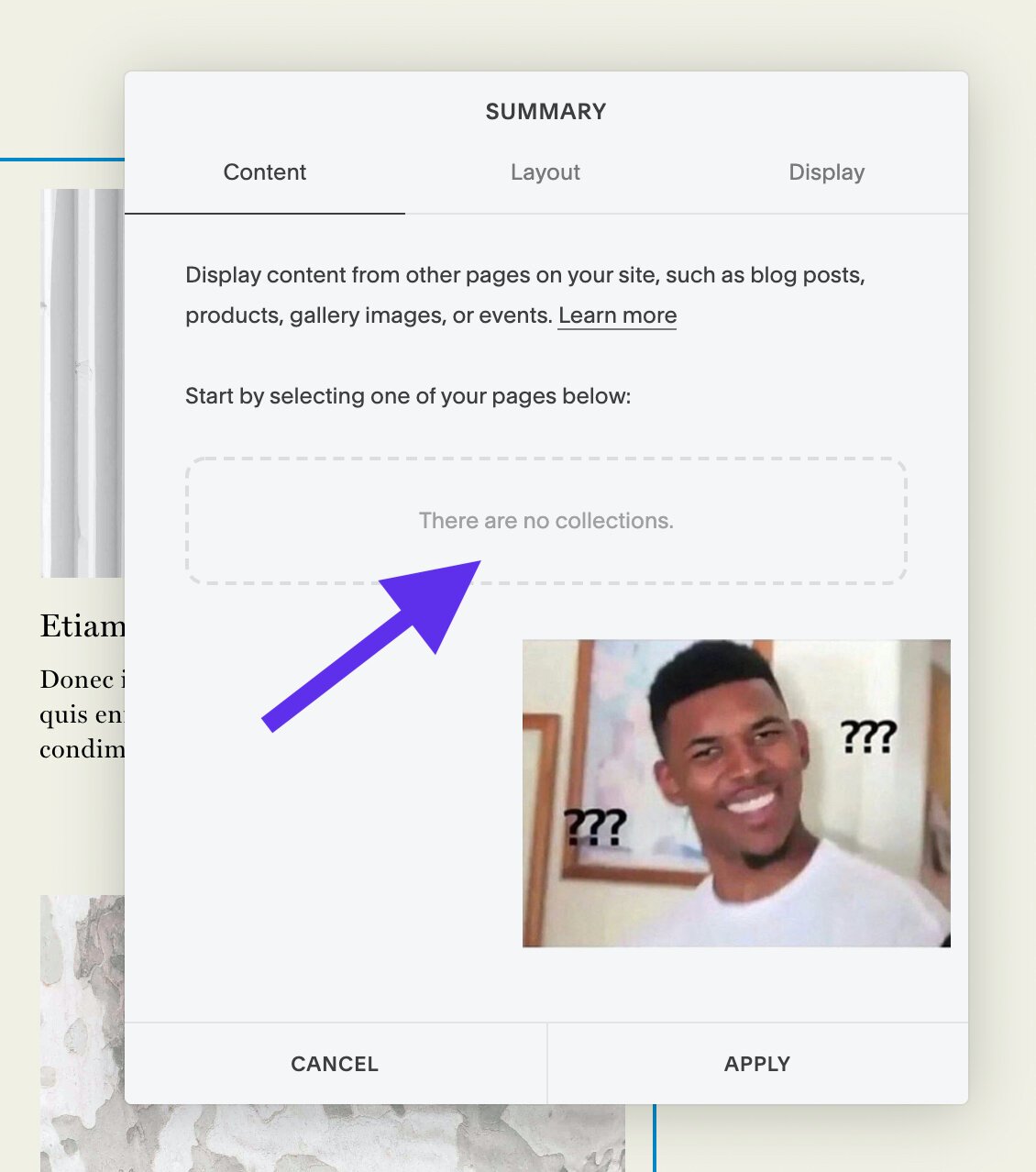
Adding insult to injury, Summary Blocks (another insanely useful tool in Sqsp 7) are out too. Since no gallery page collections can be created, Summary blocks usefulness is severely hampered and there becomes effectively no method of adding a collection of images to the Squarespace grid system. RIP.
Duplicating Index Sections
This is going to be another sticking point that most designers aren’t going to notice right away, but will eventually become infuriating. 7.1 does not allow for the duplication or moving of index sections. In 7.0, long scrolling index pages were comprised of normal Squarespace web pages stacked on one another. This allowed designers and clients to clone certain pages, rearrange them, and move them from one index to another if desired.
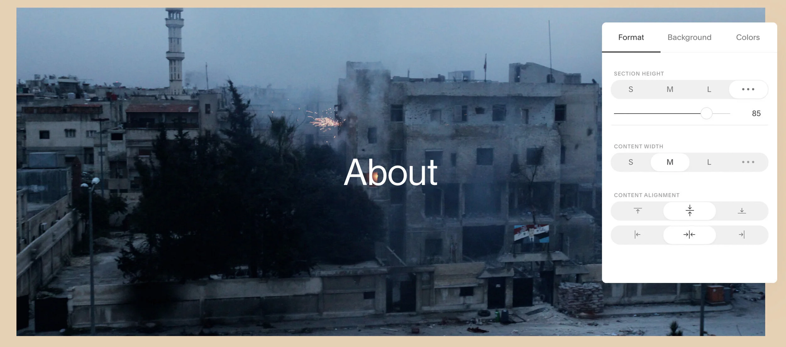
Index sections have some nice new controls (right) but duplicating or moving sections is a no-go.
In many ways Squarespace 7.1 builds on the Index page functionality and brings many improvements to that concept. But the inability to clone or move sections will cause a lot of frustration and wasted effort. When building a complex page, it’s easy to sink many hours into adding and arranging content in Squarespace’s 12 column grid. And whenever our ability to clone content is hampered, you can bet there will be a lot of time and efficiency lost while doing grunt work that could have been avoided by a simple “duplicate” button.
In Conclusion
Wrapping up, we think that Squarespace 7.1 has a lot of potential and we’re excited to see how these new tools will let all of us build even better and more beautiful websites. There are a few major issues at the moment that keep us from being able to wholeheartedly recommend 7.1 for our clients. If Squarespace can address some of the gallery and index section flexibility issues, we could become big fans of 7.1. Til then, we’ll be sticking with our trusty 7.0 while keeping an eye on the future developments.


